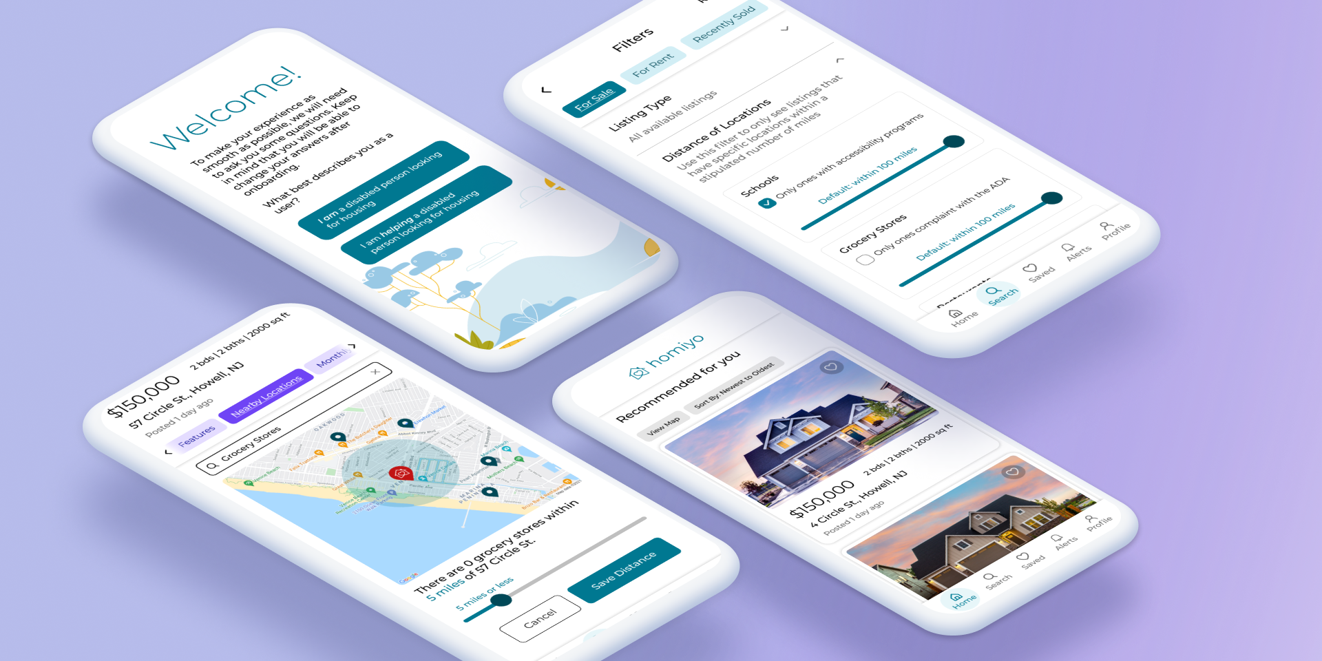
Homiyo
An online platform that will provide ADA-compliant listings of properties for disabled individuals to help identify available homes and apartments that will accommodate their specific needs
TIME PERIOD
8 weeks, Fall 2021
RESPONSIBILITIES
Product Vision, Business Rationale, Proto-Personas, User Flows, Prototypes, User Testing, Design System
TOOLS USED
Figma, Zoom (for user testing)
OVERVIEW
For my Prototyping class at MICA, we were to design a real estate app.
COMPETITIVE BENCHMARKING
Neither Zillow, Trulia, or Redfin have a filter that allows people to see whether a listing is accessible
There are housing resources for people with disabilities, but they don’t have a lot of listings
Whereas there are many organizations that help disabled people find housing, there’s no way for disabled people to look up all the available housing themselves
THE GOAL
I would build an online platform that will provide disabled people listings of apartments/houses that are ADA-compliant. It’s like Zillow and Trulia, but for disabled people.
My product would fit into a gap that disabled people face when looking for housing: an app that compiles all available ADA-compliant housing in one platform, gives information on distance between key locations, and contains all the filters that other property-search platforms have.
USE CASES + (PROTO) PERSONAS
Use Case 1: Finding locations that are nearby a specific listing
Use Case 2: Filtering for listings with accessible schools nearby
Use Case 3: Going through the onboarding experience
To view the full proto-personas, please click here.
DESIGN PRINCIPLES
To ensure that the app is pleasing for people of any disability to use in order to find a suitable home, I wrote down key design principles.
Be Inclusive.
Ensure that all users can access and utilize our experience equally and self-sufficiently
This makes the app usable for disabled people
Stay Focused.
Reduce the numbers of calls to actions that the user sees at once
Helps the user accomplish their goals
No Surprises.
Maintain consistency in the way the app organizes information
This helps streamline the process of finding a listing
Document Everything.
Abide by Miller’s Law
Users should consume the appropriate level of content and have tools available to dive deeper
IDEATION + DESIGN
LO-FI PROTOTYPES
After making the user flows to help myself get a grasp on how the proto-personas would accomplish their goals, I then went ahead and made low-fidelity prototypes of each use case of the three use cases.

Use Case 1: Finding Nearby Grocery Stores

Use Case 2: Filtering for Listings with Accessible Schools Nearby

Use Case 3: Going Through the Onboarding Experience
STREAMLINING + ADDING IMAGES
For the sake of coherency, I decided to redo the user flows and focus on one process for each user flow and then go more in depth into each flow. To see more about the second version of the user flows, please click here.
With the mid-fidelity prototypes completed, I was then able to start testing.
Click on the images of the mid-fidelity prototypes to see them larger.

Use Case 1: Finding Nearby Grocery Stores

Use Case 2: Filtering for Listings with Accessible Schools Nearby

Use Case 3: Going Through the Onboarding Experience
TESTING + REFINEMENT
USER TESTING PROCESS
I had six participants go through the three user flows that I detailed in previous sections. From there, I had them show me how they would complete certain tasks on the app.
Here were the tasks I had them walk me through:
Finding nearby grocery stores (Use Case 1)
Filtering for listings with accessible schools nearby (Use Case 2)
Going through the onboarding experience (Use Case 3)
WHAT I LEARNED
From testing the mid-fidelity prototype out, I was given some direction in how to improve the app so that it would be more user-friendly, specifically with regards to the three use cases. Below is a summary of what I learned from testing each user flow.
Click on the images to open them in a new window.


INCORPORATING WHAT I LEARNED


DESIGN SYSTEM


STAYING TRUE TO OUR DESIGN PRINCIPLES
Being Inclusive:
High-contrast colors
Made color scheme AA compliant - the final color scheme is different from the previous ones, which weren’t compliant at all.
Staying Focused:
Minimal calls to action per screen
Only include items directly relevant to the task at hand
No Surprises:
Similar organizations and layouts for each screen
Layout also consistent with that of other real-estate apps so user knows what to expect
Documenting Everything:
Example of this: user’s like history
Filters entered when searching for properties are visible on the search page
CONCLUSION
I learned…
How important it is to continuously make changes, not just after you do user testing. If I hadn’t streamlined the user flows or changed the color palette, my design would have been far more unfocused.
That time is of the essence. I worked on this project while I was also working a full-time internship, so making time to design Homiyo was a challenge. This experience helped me understand what’s important to a design and what isn’t so important.
In the future…
I will make sure Homiyo is inclusive and accessible in more ways than just through its color combinations.
I’ll also make sure that the design fits an actual phone - when I placed the screens in the mockup of an actual phone, I found that some of the screen was covered.