Breathabö
Designing the web page for a customizable respirator
TIME PERIOD
Spring Semester, 2020
RESPONSIBILITIES
Research, User Personas, User Journey, Site Architecture, Wireframes, Visual Design, User Feedback
TOOLS USED
Photoshop, Adobe XD
Overview
THE BACKGROUND
Because many healthcare workers have lost their lives due to overworking to contain COVID-19, I decided to make a mask that would be reusable, easy to clean, and easy for healthcare workers to use so they won't be so burdened.
THE PROBLEM
Changeable color was such a fundamental part of the actual Breathabö product; therefore, customers would need a place where they could customize their respirator.
THE GOAL
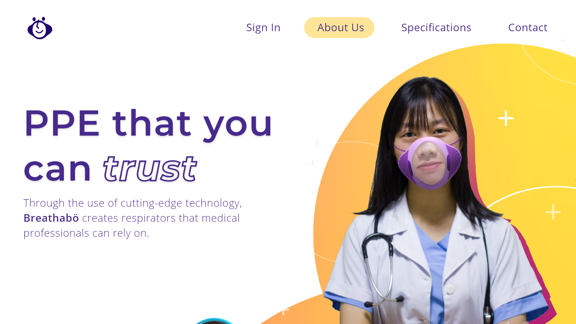
What I ended up creating was a website that was both aesthetically pleasing in the manner that the Breathabö product is, and easy to navigate.
Because the website is supposed to have the same visual qualities as the respirator, I focused on making it bright and cheery, simple, and approachable.
Product Definition
PROTO-PERSONAS
I created proto-personas of potential visitors so I could get an accurate feel for who they are and what their tastes (visually) would be. I came to the conclusion that they would like something that's not only bright and cheery but also classy and professional. I then created a user journey map for Jasmine, to see what her pain points would be.


USER JOURNEY
Creating the user journey helped me deduce the important functions of the website asides from the customization aspect - for instance, it's important for the user to get a confirmation page that gives them approximately when their mask will be ready for them.
Additionally, it gave me an idea of how important accessibility of information about the mask is. When customers are exploring options for respirators, they need to be convinced of the respirator's technology and its superiority.

SITE ARCHITECTURE

Since the objective was to construct the pages where the user would be customizing and thereby purchasing their mask, I defined the site architecture, specifically the parts where the user customizes their mask.
From here, I learned that the clearest way to organize the website is to partition the different areas of customizability.
Wireframes + Prototypes

LOW-FIDELITY
I was able to approximate the placements for components such as images, texts, and so forth, as well as what should be included and excluded.
For many of the pages, I used the golden ratio to map out the composition.
HIGH-FIDELITY
I focused on embellishing the design of each page, as well as completing the frames for each transaction for each function of the website.
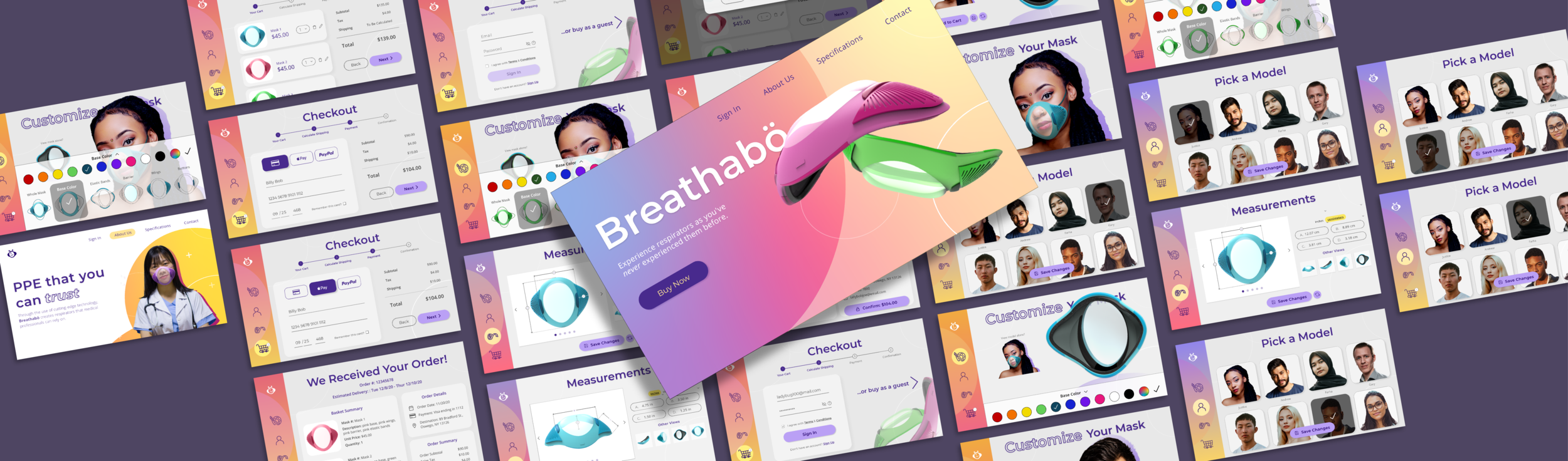
Here is just a portion of what the wireframe is composed of, with every function (customizing the mask, purchasing the mask, etc.)

Revisions
After the first development of my the website, I realized that the colors weren't appropriate for my user base. Although the font choice is classy and professional - just as my user persona would like them to be - the colors were too over the top. Many potential customers may be repelled by the liberal use of pink on each page.
Additionally, since this is a site that's catered to healthcare professionals, I came to the conclusion that although it should still be colorful so as to convey a sense of creativity and joy, I should be more tactful and deliberate with my placement of bright, vibrant colors.
Below, I highlight the main differences between the two designs with examples from one page:
Before

Heavy use of pink and other vibrant colors
Little to no white space
Small white text in the description is hard to read
Composition is jumbled
After
The pink-orange-yellow color scheme has been replaced with something that's purple and yellow
Much more white space; more professional
Page isn't cluttered with elements
Visual Design
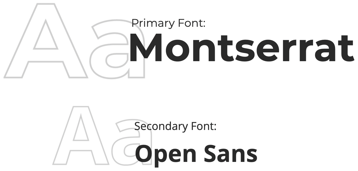
TYPEFACE
Like the Breathabö product itself, I aimed to make the website's appearance appealing, bright, and cheerful.
I did this through the use of vibrant colors, sans-serif typefaces, and rounded iconography.
PALETTE + ICONS


Final Design
Here are some of the major functions that can be explored on the website.

Onboarding
I demonstrate navigating the site from the landing page.

Changing Perspectives + Adding to Cart
On the customize page, you can change whether you see a close-up back of the mask you're designing, or the model wearing the mask.

Customizing Colors
You can customize the colors of various elements of your respirator simply by clicking on the "paint" icon on the left panel. You can change the color of the whole mask, or go by specific components.

Picking a Model
I show how you can go pick a different model to wear the mask you want to buy. I chose models with a variety of appearances so that any customer can find one that looks like them. That way, they can see what their mask would look like with various skin tones and hair colors.

Editing the Measurements
On the measurements page, I show how you can change the unit of measurement, adjust the dimensions of certain areas of the mask, and change the view of your mask so that you can get a better feel for the dimensions.

Checkout
Part 1
First, I deleted a mask. Then, I buy as a guest. I'm not able to see the cost of shipping until I enter the shipping information.

Part 2
After entering the information, I enter the payment page, where I can pay either through credit card, Apple Pay, or PayPal.

Part 3
I then confirm the purchase. Here, you can also see the loading screen before you get the confirmation of your purchase.
User Feedback
I asked subjects to test out the prototype. Here's the feedback I got:
When it came to navigating the 'customize' pages, subjects had no problem. One person said that it's "[d]efinitely easy for people to use and figure out." One suggestion was that on the landing page, there should be some explanation on what the product actually is.
For the checkout pages, they also didn't have any problem navigating it.
Overall, people enjoyed the aesthetics of the website. One subject says the logo is "very cute".
Reflection + Moving Forward
A few things I learned along the way...
1. Find balance when it comes to visual design. Because I was so focused on making the interface as bright and as cheery as possible, I neglected the fact that the users, while in need of some cheering up themselves, are adult professionals who may not appreciate such vivid color choices.
2. Adobe XD auto-animation makes all the difference. Upon learning of this relatively new feature, I was able to bring my designs to new heights. Granted, at the beginning I confused myself a lot with all the layers I had to copy and arrange; however, I fully anticipate using this function in the future.
Overall, I'm happy with the way this turned out.
I would also like to conduct more user research in general in order to verify my design decisions and make adjustments as needed.